
The New Zealand Society
Brand Refresh
The New Zealand Society
Brand Refresh
Since 1927, The New Zealand Society has been the heartbeat of the Kiwi community in the UK. A century of connection. Royal patronage. An extraordinary network of New Zealanders forging lives far from home, but never letting go of where they came from.
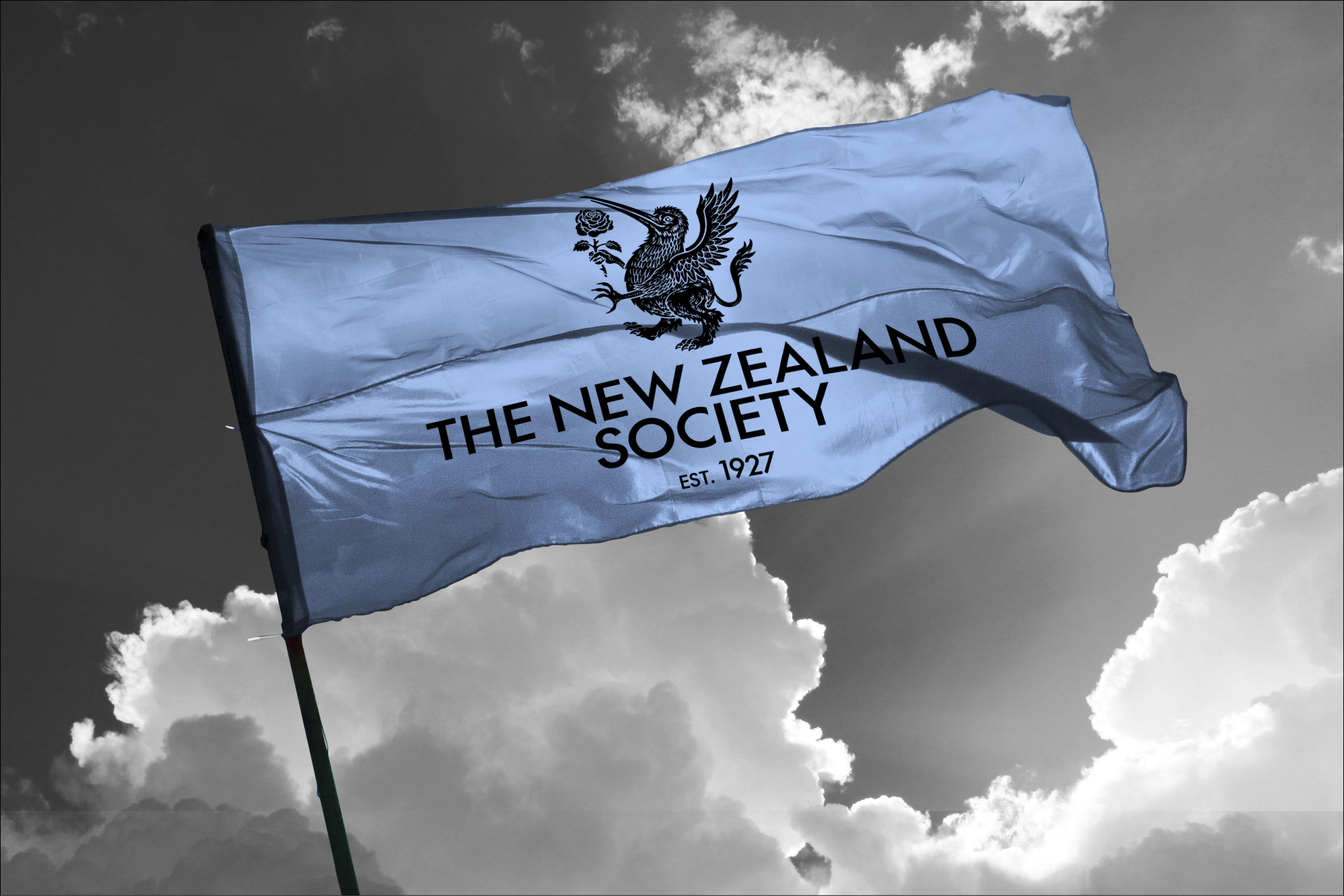
Approaching its centenary, the Society needed an identity worthy of that legacy. A fern in black and grey couldn't carry it. The New Zealand Society isn't just another members club. It's the unofficial embassy of New Zealand's most powerful offshore community. Its mark needed to reflect that.
Member clubs are everywhere. From co-working spaces to networking societies, the concept has been so thoroughly diluted that membership means little and belonging means less. But for Kiwi expats, the stakes are different. Far from home and forging a new life, the connections they build here run deep. They find each other. They champion each other. They call it home.
The brief: position The New Zealand Society as a gateway to an exclusive network that transcends time and geography.
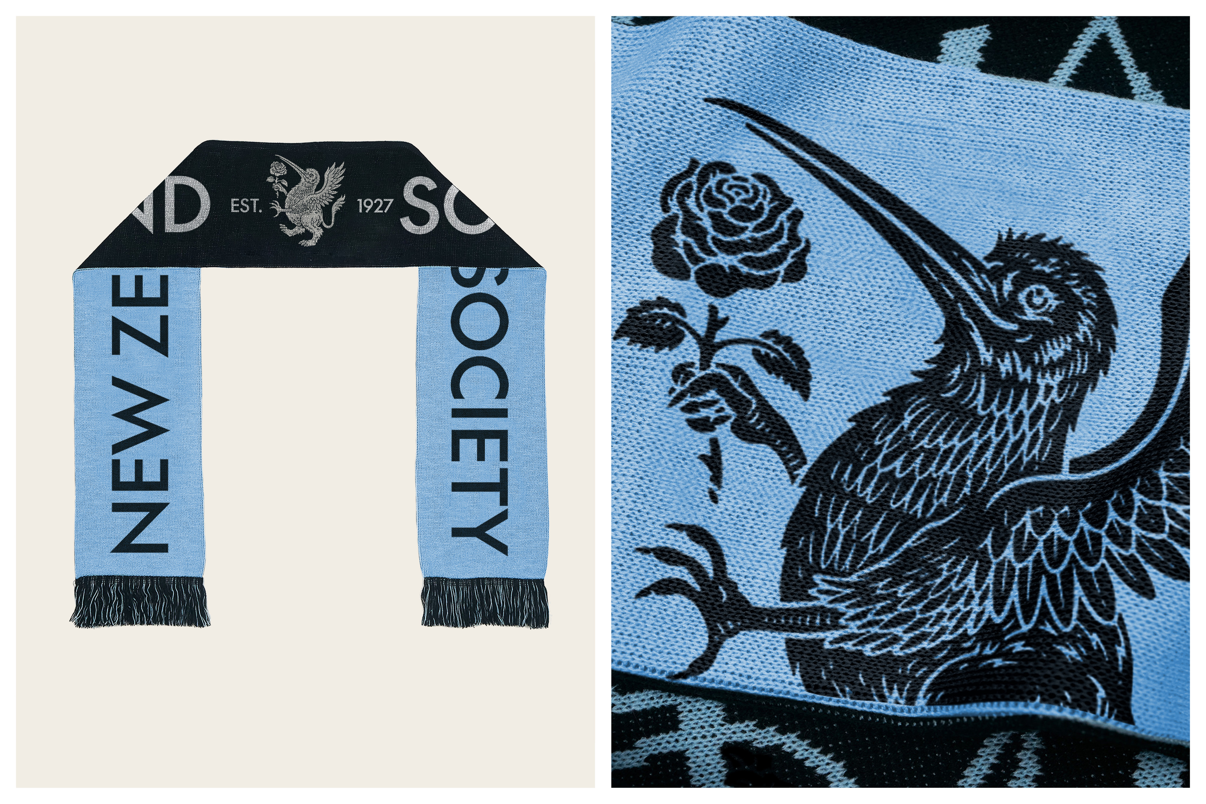
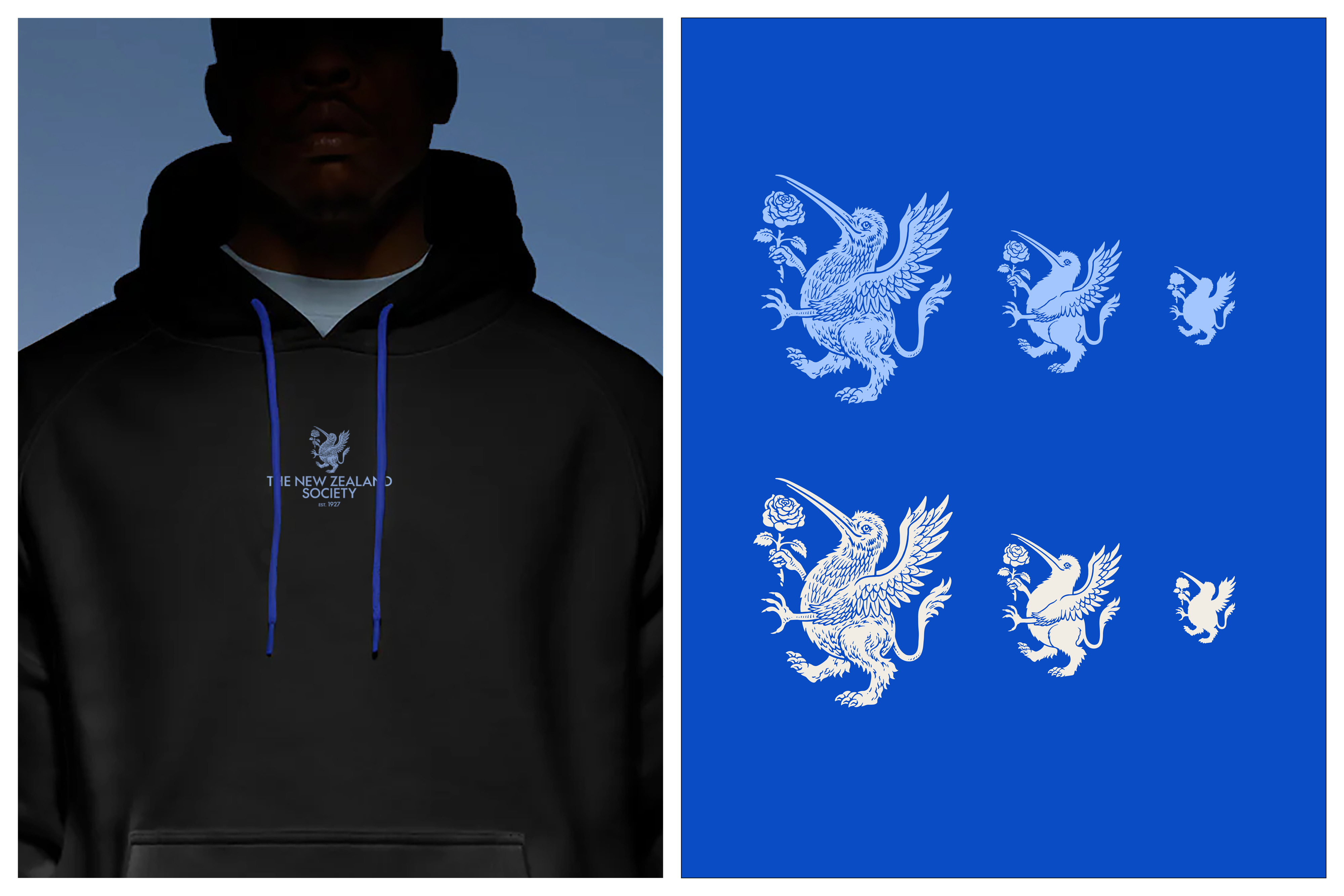
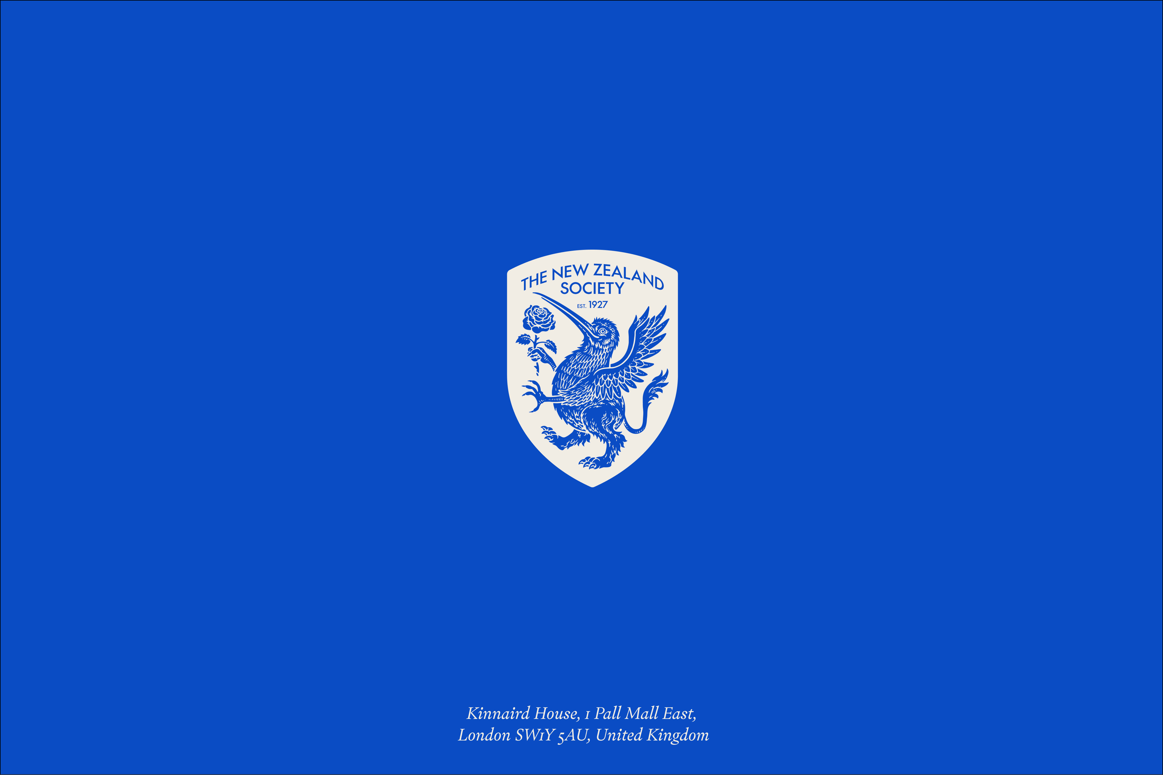
The solution: the Kiwi Griffin.
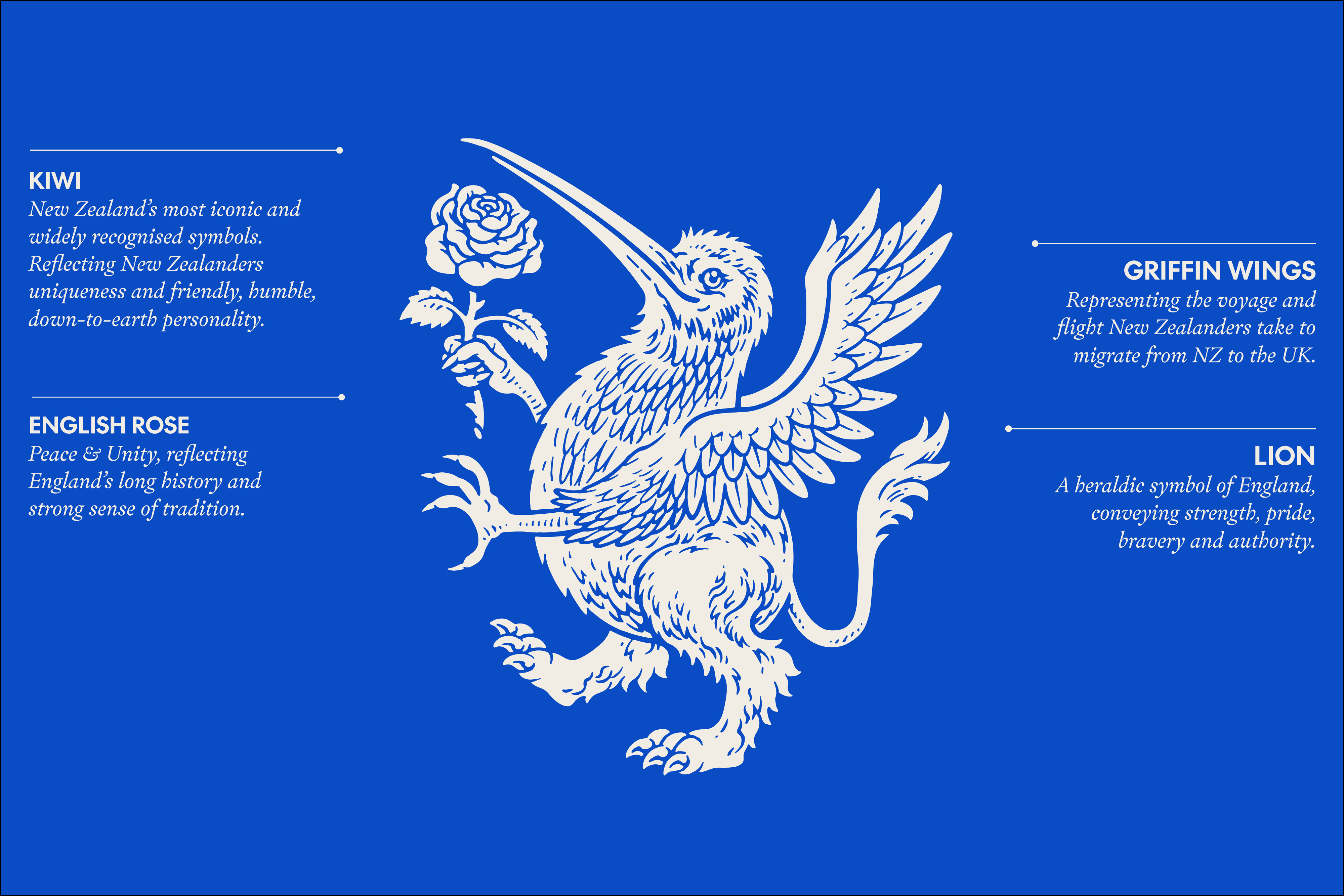
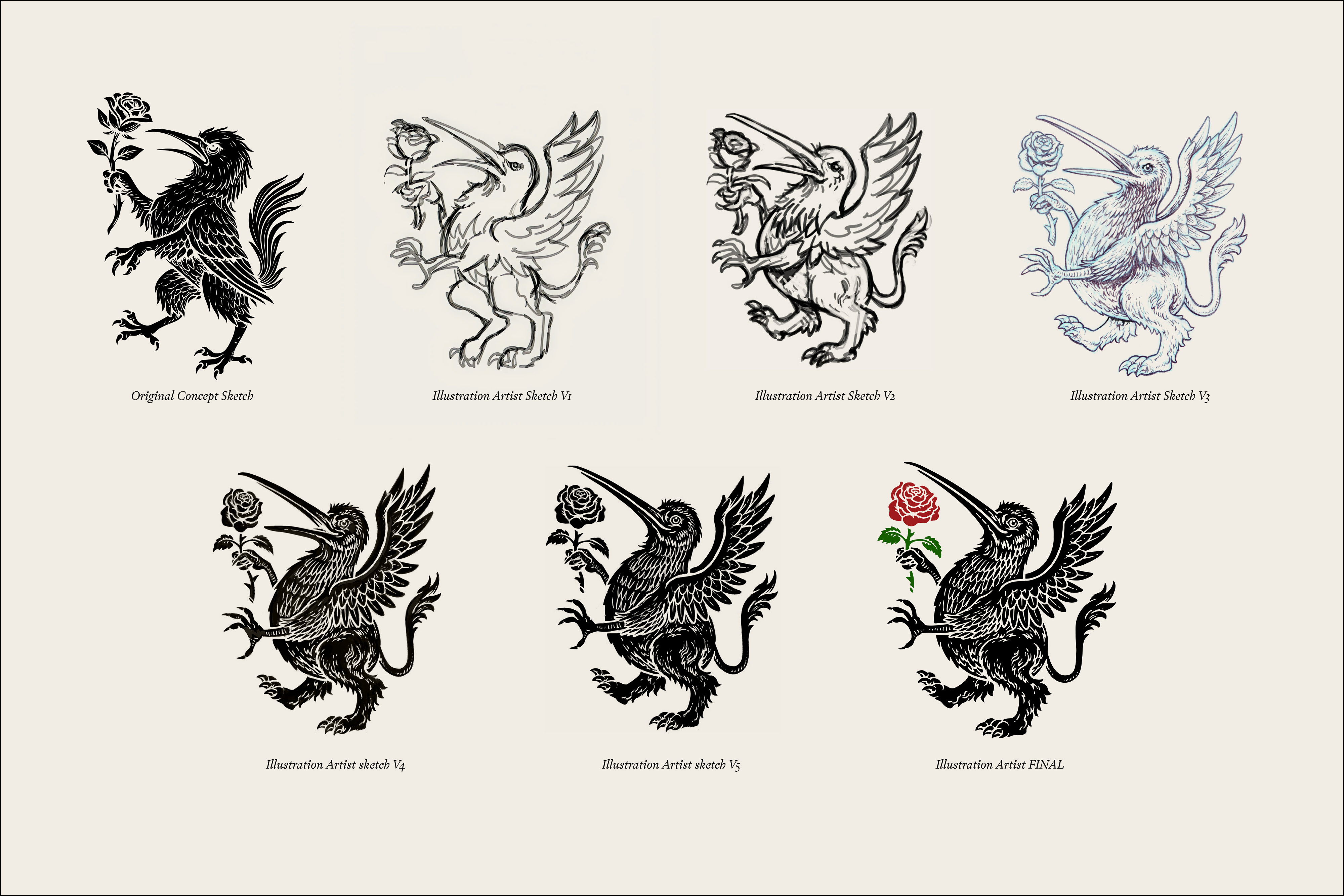
Drawing on centuries of heraldic tradition, the Griffin is a symbol of strength, protection, and leadership. The language of institutions built to last. Its body is unmistakably Kiwi: proud, grounded, uniquely New Zealand. Wings and tail honour the voyage across the world. An English Rose held in its grasp bridges two nations.
It's not just a logo. It's a declaration. A mark that any Kiwi anywhere in the world can see and feel immediately: that's where I belong.
An emblem as rare and remarkable as the community it represents, and one that will carry The New Zealand Society proudly into its second century.
Flex by Farmlands
Intelligent energy makes farms work harder

EDUCATION NEW ZEALAND
Think New

Sexual Wellbeing Aotearoa
A Nurturing Space

Picker’s Pocket
Brand Creation & Packaging

Petdirect
Brand Identity
